Effective church event flyer design requires a clear visual hierarchy consisting of a compelling headline, essential event details, and a strong call to action. Designers should focus on using complementary fonts and ample white space to ensure readability while avoiding cluttered layouts that distract from the ministry's message. Organizing information into distinct sections helps capture attention and effectively promotes upcoming services or community gatherings.
You spend weeks planning a powerful sermon and organizing logistics, but if your event flyer looks dated or cluttered, your community might never step through the doors. A poorly designed graphic does more than just fail to inform; it inadvertently signals a lack of care to those seeking spiritual connection. In a world saturated with high-end visual marketing, your ministry deserves graphics that reflect the excellence of your mission. This guide explores how to bridge that gap by mastering the art of professional design. We will examine the essential anatomy of a high-impact flyer, explore modern aesthetic trends for contemporary outreach, and discuss how to choose the right tools for your workflow. From practical dos and don'ts to budgeting for professional assets, you will gain the insights needed to create promotional materials that truly get your ministry noticed.
Why Your Church Event Flyer Design Matters for Ministry Growth
A church flyer often serves as the digital front door or the first physical touchpoint a visitor encounters before ever stepping into a sanctuary. In the context of the Great Commission, every piece of media produced is a tool for outreach and evangelism. When a ministry commits to high quality church event flyer design, it is not just pursuing aesthetics; it is reflecting the excellence of the message it carries. A poorly executed graphic can inadvertently signal a lack of care, potentially discouraging someone from attending a life changing service.
In the vibrant and bustling communities across Kerala, the visual landscape is incredibly crowded. From colorful street side notice boards to fast moving WhatsApp groups and Instagram feeds, your ministry competes for seconds of attention. To cut through this noise, visuals must be professional and intentional. Utilizing professional creative design services ensures that your event stands out rather than blending into the background. Visual excellence builds immediate trust with the unchurched, suggesting that the same level of care given to the graphic will be present in the worship experience and the teaching. Consistent sermon and series branding further reinforces this identity, turning a single flyer into a recognizable symbol of your ministry growth. Establishing this standard requires a deep understanding of the fundamental elements that make a design work.
The Anatomy of an Effective Church Promotional Flyer
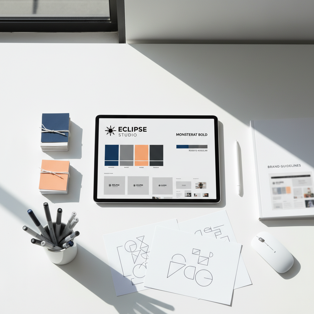
Establishing a standard of excellence begins with mastering visual hierarchy. This is the strategic arrangement of elements to guide the viewer’s eye through a logical path. A successful layout usually follows a three section structure that prioritizes the hook, the details, and the call to action. By managing these layers correctly, you ensure that even a casual glance communicates the most vital information.
At the top of the hierarchy, the headline must serve as the primary focal point. It should be bold and concise, communicating the core purpose or theme of the event immediately. The eye should then naturally drop to the middle section containing the logistics: date, time, and location. These supporting details need to be legible at a glance, utilizing high contrast colors and clean typography to ensure clarity. A common pitfall in ministry graphics is overcrowding these sections with excessive text; effective design relies on intentional white space to let the most important information breathe.
The bottom of the flyer belongs to the call to action (CTA). Whether it is a website URL, a QR code for registration, or a specific social media handle, this element must be unmistakable. Trust is further established through the use of imagery. While stock photos are convenient, they often feel impersonal and disconnected from the local culture. For ministries in Kerala, using high quality, ministry specific photography of your own congregation or worship space creates an authentic connection. It shows visitors exactly what they can expect, reinforcing the brand identity built through sermon and series branding. When you integrate real faces and local ministry moments, the flyer becomes a genuine invitation into your community. This professional approach to professional creative design services ensures that every visual component works in harmony to drive engagement.
Modern Church Flyer Design Ideas for Contemporary Ministries
Modern church flyer design has shifted toward a refined, editorial aesthetic that prioritizes clarity and impact. Current trends favor minimalist layouts where one central, powerful image or a singular typographic concept takes center stage. This approach respects the viewer’s time by removing unnecessary distractions, allowing the heart of the message to resonate immediately. Bold typography is particularly effective; large, heavy fonts can serve as the primary visual element, turning words into art.
Specific event types demand tailored visual languages. High-energy youth rallies or conventions often benefit from duotone color effects, where two contrasting hues replace traditional photography tones to create a vibrant, high-impact look. For special worship nights, utilizing moody, atmospheric photography with soft lighting helps convey the tone of the gathering before a visitor even arrives. Executing these specialized looks effectively often requires a deep commitment to sermon and series branding to ensure the visual narrative remains consistent across all touchpoints.
Event Type | Design Focus | Recommended Visual Trend |
|---|---|---|
Youth Rally | Energy and Excitement | High-contrast Duotone / Glitch Effects |
Conventions | Authority and Structure | Bold Typography / Minimalist Grids |
Worship Nights | Atmosphere and Spirit | Atmospheric Lighting / Blurred Motion |
Weekly Study | Clarity and Detail | Simple Layout / High White Space |
While bold styles work well for large outreach efforts, a simple church flyer design is often more appropriate for routine weekly gatherings like Bible studies. Simplicity in these cases ensures maximum readability, focusing on the essential details without visual clutter. For ministries in Kerala looking to modernize their outreach, integrating these trends into your church event flyer design strategy provides a professional edge. When a ministry transitions from generic templates to professional creative design services, it ensures that every graphic, from a simple prayer meeting notice to a large-scale convention banner, maintains a standard of excellence that reflects its mission.
Choosing the Right Tools for Your Design Workflow

Executing these sophisticated styles requires selecting the right software for your ministry’s current stage and specific needs. For small volunteer teams, Canva serves as a practical entry point. Its drag and drop interface and library of templates allow for rapid production of basic announcements. For social media managers who need to post live updates to WhatsApp or Instagram during a youth rally, mobile apps like Picsart offer immediate, on the go editing capabilities that prioritize speed over technical depth.
However, there is a clear distinction between a quick template and professional grade ministry branding. Adobe Photoshop and Illustrator remain the industry standards for high resolution church event flyer design. These tools allow for precise control over typography, color grading, and complex lighting effects that DIY platforms cannot replicate. A comparison of these tools helps determine the best fit for specific tasks:
Tool | Primary Use | Best For |
|---|---|---|
Canva | Quick Templates | Weekly bulletins, small announcements |
Picsart | Mobile Editing | Social media stories, on the go updates |
Adobe Photoshop | Professional Branding | High-fidelity flyers, large scale banners |
When a ministry prepares for a major convention or a new teaching year, transitioning to professional creative design services becomes a strategic investment. High stakes events require the technical precision of professional software to ensure that graphics remain crisp when scaled for large format outdoor banners or high definition broadcasts. Furthermore, establishing long term sermon and series branding is more effectively managed by experts who can maintain a cohesive visual identity across multiple mediums, from physical print to digital assets.
Church Flyer Design Dos and Don'ts for Maximum Readability
Effective church event flyer design relies on the delicate balance between information and inspiration. To ensure your message is not lost in the visual noise of a local notice board or a fast-moving WhatsApp group, you must prioritize readability. High contrast is your most powerful tool; pairing dark text against light backgrounds or bright text against deep, saturated colors ensures the core message pops instantly. Limiting your palette to two or three complementary fonts prevents visual fatigue, allowing the reader to focus on the message rather than the decoration.
Avoid the common mistake of the "kitchen sink" approach where every minute detail, verse, and speaker bio is crammed into a single graphic. Overcrowding leads to cognitive overload, causing potential attendees to scroll past. Instead, leave ample white space to let the headline breathe and use a QR code to link to a landing page for full schedules or registrations.
Design Principle | Do | Don't |
|---|---|---|
Imagery | Use high-resolution, original ministry photos | Use pixelated or watermarked stock images |
Layout | Leave ample white space around text | Overcrowd the layout with long paragraphs |
Call to Action | Include a clear QR code or registration link | Forget the final step for the visitor |
Typography | Stick to 2 or 3 professional fonts | Mix more than 3 unrelated typefaces |
While minimalist, text-only designs are a modern trend, exercise caution with a church flyer design without pictures. Research indicates that visuals drive 90 percent of information processing in the human brain. Unless your typography is exceptionally strong and serves as the art itself, a lack of imagery can make your ministry appear impersonal. For high-impact results, integrating these principles into your sermon and series branding ensures a cohesive identity. If your team struggles to balance these elements, seeking professional creative design services can help elevate your outreach from a simple announcement to a powerful invitation.
Designing for Outreach: Tailoring Graphics for Different Platforms

Effective church outreach flyer design requires a strategic shift in perspective depending on where the graphic will live. A single design rarely translates perfectly across all mediums. While a physical flyer pinned to a bulletin board in Kochi might utilize a standard A5 or A4 vertical layout with rich detail, a WhatsApp status update or Instagram story requires a 9:16 aspect ratio. In these vertical, full-screen environments, the most critical information must be placed in the safe zone, away from the top profile icon or the bottom reply bar.
For social media feeds like Instagram or Facebook, a 1:1 square or 4:5 portrait ratio is essential to maximize screen real estate. Consistency is the anchor of these digital efforts. By utilizing the same color palette, logo placement, and typography across every platform, you ensure your ministry brand is instantly recognizable. This cohesion is the core of sermon and series branding. When a community member sees a flyer on a street corner and later encounters a matching graphic in their WhatsApp group, the repetition builds familiarity and trust.
Platform | Recommended Aspect Ratio | Best Usage |
|---|---|---|
Printed Flyers | A5, A4, or 4:6 | Physical distribution, church notice boards |
Instagram/FB Feed | 1:1 or 4:5 | Permanent event announcements, engagement |
Stories/WhatsApp | 9:16 | Urgent reminders, countdowns, short clips |
Leveraging professional creative design services helps your ministry navigate these technical requirements, ensuring that every asset, from a high-resolution print to a low-bandwidth mobile graphic, maintains the integrity of your church event flyer design.
Investment and Value: How Much Should You Budget for Graphic Design?
Determining the financial investment for ministry graphics depends on the scope of the project and the level of expertise required. If you are hiring an independent freelancer for a single church event flyer design, costs often range between ₹1,500 and ₹5,000 per asset. While this fits smaller budgets, it often lacks the strategic depth of a full campaign. For ministries seeking a more robust presence, engaging a production company for a comprehensive event package typically starts around ₹7,500 and scales upward based on the number of digital and print variations needed.
Service Level | Typical Cost Range (INR) | Primary Deliverables |
|---|---|---|
Independent Freelancer | ₹1,500 – ₹5,000 | Single flyer layout, limited revisions |
Professional Creative Studio | ₹7,500 – ₹20,000 | Flyer, social kit, high-res print files |
Full Series Branding | ₹25,000 – ₹50,000+ | Sermon graphics, stage design, video assets |
The true value of professional creative design services lies in the longevity and recognition of your ministry brand. Cheap templates might save money initially, but they often fail to capture the unique spirit of a local congregation. U4CHIRST CREATIONS approaches this by treating every graphic as a building block for your ministry reputation. By investing in professional sermon and series branding, you create a cohesive visual language that follows your audience from their social media feed to the church sanctuary. This consistency transforms a simple event into a recognized brand, ensuring that every rupee spent contributes to a professional presence that inspires confidence in your mission.